
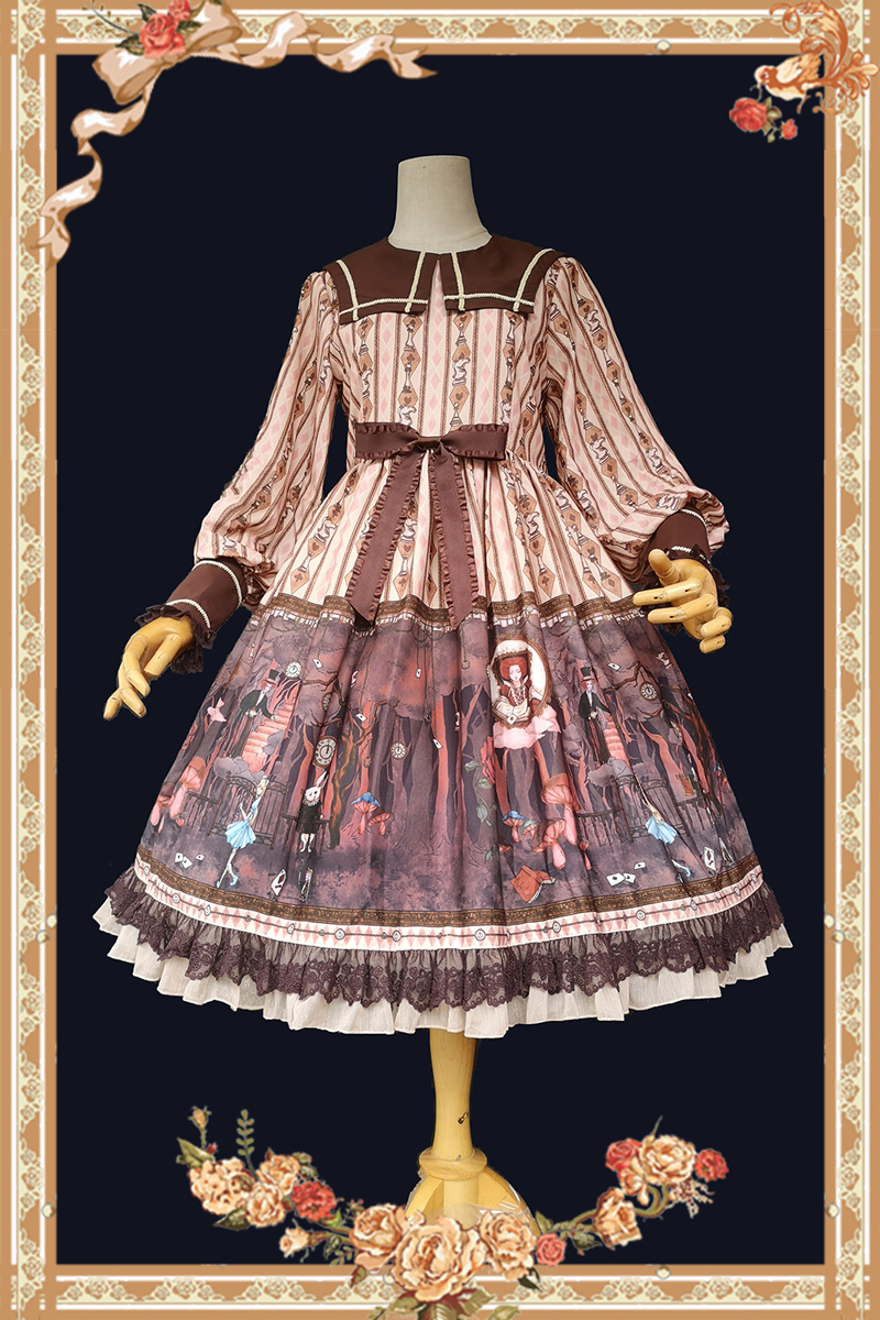
Recently, there has been a personal attack on my taste, my style, and the very fiber of my being. This came in the form of Alice and the Pirates' 2021 wine dress Secret Adventure and the Winery of Happiness ", which has four colorways, none of which are black or wine. Furthermore, each colorway is desaturated and about the same level of brightness, falling into the category of what I am going to call "noncommittal colorways".
 |
Secret Adventure and the Winery of Happiness art, "Lavender" |
 |
| Secret Adventure and the Winery of Happiness art, "Gray" |
 |
| Secret Adventure and the Winery of Happiness art, "Beige" |
 |
| Secret Adventure and the Winery of Happiness art, "Green" |
A noncommittal colorway is one that is neither light nor dark, is desaturated, and doesn't really strike one as being particularly one color or another. They lack a strong contrast with any print designs. Most importantly, they don't easily match with either 'traditional' lolita colors like sax and black or with other items from different brands in the same stated colorway.
These colorways can be found in every style, but I've been seeing them most in newer-styled sweet and classic. This phenomenon is probably due to many different of factors: here are just a few of them.
Larme and Lolita
I partially blame Larme-kei for this. Larme is a Japanese fashion magazine first released in 2012, but its style reached the English-speaking world (according to Google Trends) around 2015.
 |
| A spread from Larme Issue 29, 2017, from emiichan |
Larme-kei has loose style rules, especially compared to lolita. I'm no Larme-kei expert, so take my words with a grain of salt. In general, the magazine and style tend to feature layering, differing opacities, sleepwear (especially nightgowns and slippers) worn as daywear, the juxtaposition of loose and tight items, gingham, hearts, and most importantly for our purposes, muted color palettes including subdued pale pinks, desaturated watery blues, and neutral grays. This sleepwear inspiration is especially apparent in the Dreamy Negligee and Suya Suya Toys releases from AP, both from 2017.
 |
| Dreamy Negligee OP, AP, 2017 |
 |
| Suya Suya Toys JSK, AP, 2017 |
Style diversity
I also blame the diversification of the Lolita marketplace. With the increase in lolita population and the proliferation of independent brands (especially in China) comes an increase in micro-trends and micro-styles within lolita. Things like clown lolita and idol lolita, which would once have been simple themes limited to a couple of dresses, are now widespread to the point of ubiquity. Lolitas, princes, and gentlethems, we have reached the point where it is entirely viable for someone to own an entire lolita wardrobe in cow print and denim, and if that isn't amazing, I don't know what is.
With this style diversity and drive to stand out comes new colorways; naturally, though, not all of them will be winners. This is additionally complicated by independent brands' tendency to release only one or two colorways, rather than the full assortment that the main Japanese brands tend to provide. Infanta is a brand that enacts these tendencies to a tee; they're a well established Chinese brand with dozens of releases that mostly come in three colorways or fewer.
 |
| Alice in the Dark Forest OP, Infanta, 2021 |
This colorway is called "apricot", which is a term Chinese brands sometimes use to describe warm orangey ivory colorways. However, the lighter parts of this colorway are more ambiguously placed between this apricot and a darker latte color. The skirt print is also an in-between color, mixing mauve, orchid, grape, and even touches of scarlet, none of which are common lolita colorways. Infanta, in this OP, created their own mid-tone palette; they did not hesitate to reject the bright saturated pastels or deep pure blacks that are typically associated with lolita.
Anti-Maximalism
After the OTT booms (sweet in 2008-2012 and classic shortly thereafter), a reaction took place where lolitas began asking for more 'wearable' items. I put wearable in quotes here because anything is wearable if you're brave or stupid enough. Innocent World's recent styles are a strong example of this anti-maximalism.
 |
Lily of the Valley Lace OP, IW, 2021 "Mint" |
The design of this dress is very simple for lolita, with a strong focus on the lily-of-the-valley patterned lace around the bib and cuffs, complemented by a tea-length skirt only ornamented with buttons. The 'mint' colorway is ridiculously ambiguous; I actually had to check the original listing to see what Innocent World had called this colorway. Combining the muted color and less-detailed design gives a less eye-catching impression than most lolita attire over-all: a bright red or vivid pastel mint would overwhelm the minimal design in a way that this subdued color just doesn't.
Audience maturity
Audience maturity is similar to, but not exactly congruent with, the concept of anti-maximalism explored above. A lot of brands have shifted their focus from more teen-oriented styles (i.e., short skirts, salopettes, bright colors) to subdued garments for a more 'mature' clientele. One prime example of this is Kato-san's current brand Physical Drop. Although Kato-san was known for her offbeat and sometimes loud designs while at Metamorphose, Physical Drop's clientele has matured along with her, so her current work relies more on long silhouettes and sewn details, discarding the matchy-matchy philosophy of full lolita sets for a more restrained look. That's not to say any of this is boring or looks old; it just has a bit of subtlety that takes attention to detail to appreciate. Avina-kei (an amazing activist, thoughtful blogger, and overall great person) tends to layer many restrained seeming pieces to create ethereal-yet-mature coordinates that transcend lolita categorization.
 |
| Handmade 3-tier tiered skirt [cat pattern, 68c length], Physical Drop, 2021 |
 |
| Tiered JSK with collar [Gray stripe] [1707] |
Material constraints
It wouldn't be a post complaining about current lolita trends without the obligatory attack on polyester. This time, though, it's founded in fact, as opposed to my usual mix of spite and nostalgia. To begin with, poly chiffon (a common lolita fabric nowadays) always looks lighter and less saturated than it really is due to its transparency and texture. This applies to both solids and prints, but is especially pronounced in digitally-printed items from smaller brands. Rather than the more traditional printing that larger brands can use, which forces the dye deep into the fibers, the digital printing techniques that smaller brands use only really cover the outer surface of the fabric. Digital printing on polyester is easier for small manufacturers to use because of the incredibly low minimum orders, but between flaking, fading, cracking, and the inability to get a true, deep black on the white fabric these printers use, brands may have to resort to less intense colorways for technical reasons. This is just a surface-level theory, but it could explain some things.
 |
Note the intermediate blue-purple of this colorway. Even the black cats are dark grey. In contrast, the true black used for the collar, waist bow, and hem ruffle all look much darker and richer.
 |
| Unbelievable Paradise Short Sleeve OP, Dark Star Island, Beige |
This airy chiffon print, although ornate, has barely any contrast at all. The lightweight material would be difficult to get intense colors to stick to, so the designers instead chose mutes beige, grey, green, and a touch of light red to make this design.
Brand Monopolies
When one and only one brand decides to make a series with a specific motif in an unpopular color, they basically have the monopoly on matching items until other brands catch up. Even then, matching colors online is a tricky art, as my four different 'red' headdresses can tell you. In essence, the only way to ensure a true match is to buy a full set. This is either an incidental aftereffect of design choices or a deliberate marketing scheme.
 |
Quiet Toys Room ~The Days Played with Them~ JSK II, AatP, 2020 |
This "mauve" colorway is impossible to match outside this specific series, much less the brand. Even the beige lace is a peculiar shade that's hard to find. Over all, if someone were to want headwear that matches this colorway of this print, their best bet would be to either buy the matching hair accessory or to get something custom-made. Well played, AatP.
Why I hate this trend
As someone with exceedingly limited storage space, I just don't have time, patience, or room for a million dresses in slightly different tones of gray. I already have enough of a struggle with a simple palette of black, white, and red. There is no lolita out there with infinite storage space.
Complexion wise, I need stark contrasts and saturation: I shine in black, but pastels, grays, or medium tones in general just make me look jaundiced. Some of the usage of pure-tone solids as contrast with these prints can make them salvageable for me, but I'll never look or feel genuinely good in a periwinkle dress the way I do in plain black.
Moving away from my selfish viewpoint, this trend could be difficult for newer lolitas still building up cohesive wardrobes; it's hard to create a single color story when the brands are actively thwarting it through strategically differentiated color selection. This might compound with the tendency for noncommittally-colored releases to be in fewer colorways, because the wrong colorway choices can turn a dream dress into a waking nightmare.
I can explain it away all I want, but in the end, I just do not like these colorways. They lack the rich intensity of jewel tones and saccharine cutesiness of normal pastels: they replace it with institutional khakis, stormcloud grays, institutional olives, and almost-periwinkles, which just make me feel faded and sad.
Why it might be good
The more types of colorways there are, the more someone might find their perfect dress in their perfect color. Who knows? Maybe someone is just pining after the idea of a dress the color of wet gravel. There's also the matter that not everyone has my same complexion: perhaps the grays brighten up some goth who was formerly struggling with the harshness of black. Lolita colorways, as mentioned in the point about anti-minimalism, can often be loud on their own, so toning it down can help people for whom the primary struggle in lolita is confidence.
Finally, one aspect that makes these colorways noncommittal is their lack of attachment to a particular style: whereas bright sax will typically read sweet, deep bordeaux is usually classic, and Moitie blue is synonymous with gothic, there's no story assigned yet to mauve or periwinkle or gray, and with that comes a whole dimension of possibility. Just because I can't see myself in these colorways doesn't mean that there's no space for them in lolita. In fact, the opposite might be true: maybe the next great creative leap in lolita is all about mid-tones, mixing, and breaking color expectations.
Still, AATP, give me my damn wine print in a wine colorway. Please.
I found myself switching between belly-laughing and nodding my head furiously in agreement with so much of this post! Love everything you've said.
ReplyDeleteI will also add an additional gripe: I feel like these muted colourways are also a direct reaction to a lot of fashion trends wanting to come off as more "natural" -- aka dyed in a way reminiscent of rustic processes. But rather than using sustainable dyeing processes on natural materials, we get these ugly poly gravel dresses. W H Y
Great point! Actually using the sustainable materials and methods is pricey, and profit unfortunately comes before basically all else. At least lolitas are consciously reacting against unsustainable poly, rather than ignoring it like many others do.
Delete