
Okay, this is a real one.
Color theory is often espoused as one of the keys to personal style. You might be familiar with one of a variety of color seasons systems, which lives alongside Kibbe types and somatotypes in the realm of aesthetic astrology (although medical astrology did historically have an aesthetic element).
It might seem silly for a self-proclaimed "colorway monogamist" to write a post entirely about color theory, but absurdity is life.
Before getting too far into it, I want to clarify that this won't touch on fashion-specific systems like color seasons. Color seasons are classifications (typically between 4 and 16) named after the seasons of the year-- these seasons were popularized throughout the 20th century, most notably in the 1970s and 1980s with books like Color Me Beautiful by Carole Jackson and Color Me a Season by Bernice Kentner. I used to find color seasons fun, but I really don't like them anymore. For more information on the history of color seasons, I recommend this excellent video by Nicole Rudolph.
 |
| Color Me Beautiful by Carole Jackson, an icon of the 1980s |
The Basics
What is color?
Color isn't an inherent property of matter-- it's how people use their eyes to perceive a limited range of wavelengths within the electromagnetic spectrum. Because these wavelengths are all mixed together and of various intensities, there's a lot more colors than a one-dimensional rainbow can describe.
Color can be instead described within a variety of organizational schemes, called color spaces. These use varying parameters to construct a color from several properties.
RGB, which adds together red, blue, and green, is common on the Internet. RGB mirrors the actual sensing mechanisms of human eyes; usually, humans have three types of cone cells in our eyes, specialized to see either red, green, or blue. These are the real primary colors; every color we see is our mind combining different strengths of signals for these three colors, plus the additional light/dark of our rod cells. Don't have three full sets of cones? That's colorblindness.
CMYK is common for printing: it uses cyan, magenta, and yellow inks, along with black ink as the key. In traditional art media, the primary colors are red, yellow, and blue. For the purposes of this post, and in fashion, I like to use the HSL system: hue, saturation, and lightness. This system was pioneered by Albert Munsell in the 19th century: after all this time, it still works damn well.
Do I have to?
No, there's no requirement to understand the color theory to wear and enjoy fashion. Like any fashion rules, color theory is totally optional, but it can enhance people's understanding of the clothes they like. I like it because overthinking is fun. It's also a transferable skill beyond fashion and to all visual arts.
Hue
Hue is the essential flavor of color. It's the basic wavelength from which other modifications can be made, the qualitative greenness of green or the redness of red. People identify colors primarily by their hue. The HSL system on computers describes hue through a circle split into 360 degrees, wherein 0 is pure red, 120 pure green, and 240 pure blue. Every other hour in the HSL color space can be described through the intermediate degrees in this one-dimensional color wheel.
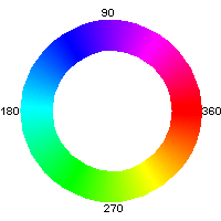 |
| the HSL color wheel, from Wikimedia Commons |
Saturation
Saturation is the intensity of a color, or its proximity to a pure variation of the color. This can be thought of as the amount of color-per-color, if I'm being silly. Saturation can also be called chroma, or the strength or weakness of a color. Going back to our HSL space, saturation is on a scale from 0% to 100%, from the least possible amount of the color to the most.
 |
| a gradient from 0% to 100% saturation of red, from Wikimedia Commons |
It's impossible with real-life materials to have something that's truly 0% or 100% saturated, and the possible intensities vary with the hues, but saturation is still a useful framework to see how colorful a color is!
Value
Value, also called lightness, is the lightness or darkness of a color, independent of its intensity. It's probably the simplest idea to express-- it's the value that differentiates black (0% light) from white (100% light) from gray (most of the in-betweens). When humans (myself included) see in low light conditions, the different hues and saturations slip away and we mostly see value.
 |
| A gradient from black to white, from Wikimedia commons |
Value, like saturation, is something that real-world clothing can't truly reach the extremes of, but we do have Culture Hustle making paints that absorb nearly all visible light (Black 2.0 ) and others that reflect nearly all visible light (White 2.0).
It's important to note that in real life, colors can't reach the truest extremes of value and saturation; some colors (like yellow) can be very intense but still look light, whereas blue can get dark pretty easily.
 |
| Datumizer's visualization of the Munsell color system, showing irregularities |
Getting Complicated
This section goes into topics beyond the bare minimum.
Temperature and undertones
Temperature and undertones are a slightly more complicated aspect of hue. Some reds, orange, yellow, and several greens are warm colors, but most greens, blue, and purple are cool. Basically, temperature is the warmth (yellowness) or coolness (blueness) of a color within a category. Cherry red? That's got a tiny bit of blue, so it's a cool red. Salmon? It's got a dollop of yellow, so it's warm. Even blues and yellows can have warmth and coolness, like turquoise (which is a very warm yellowy blue) or goldenrod (a gently reddish, warm yellow).
Undertones continue the trend of complicating a simple system. Undertones are used mostly to describe skin color, and are grouped broadly into temperatures of warm yellowness and cool blueness. However, undertones can go a lot further than that-- basically any color can be an undertone for a certain set of other colors. Spotting undertones takes a certain amount of practice, but it's incredibly useful for basically any hobby with a visual component.
 |
| a range of grays with neutral, purple, yellow, and blue undertones |
Contrast
Contrast is a property, not of a single color, but one that described the distance between different colors. Contrast is often a light-dark difference in value, but it can also describe the other parameters, such as the dramatic hue contrast between any shade of red and its opposite on the color wheel (complimentary color), cyan, or the saturation contrast between a vivid ultramarine blue and a drab slate blue.
 |
| the aforementioned colors, paired in rows |
The human complexion
Humans aren't just one color, obviously. We have eyes, skin, teeth, and even hair (if we're lucky). There's plenty of variety within all of these-- even the smoothest skin or the darkest hair will have light and dark, warm and cool, and all sorts of little variations.
This is where undertones really come into play: the majority of humans' skin tones exist somewhere in the desaturated realm of browns and beiges, which are in the warm orangey territory of the color space. However, people broadly define complexions as warm (yellowy), cool (blueish or pinkish), or neutral (neither).
Although there are a variety of techniques oriented towards learning someone's complexion temperature, such as checking the warm green-to-cool blue color of wrist veins through (light) skin, no test works on everyone; this is especially true for people with olive (greenish) skin and darker skin tones in general. The most reliable to determine a specific complexion's temperature is probably by getting multiple good foundation color matches from makeup brands that specify the temperature in their color names.
Some people will say that your skin undertone is immutable. This is wrong. Tanning can make skin look more golden-yellow, old age takes away pigment and cools complexions-- even sunscreen's white cast can subtly shift someone's complexion cooler.
 |
| a chart of warm and cool skintones from Stitch fix |
Contrast is another important parameter in the human complexion. Contrast can be broadly split into low (relatively uniform values), medium, or high (dramatic differences). I have very light olive skin (due to my indoorsmanship), dark brown eyes, and near-black eyebrows, so there's a lot of visual contrast to me, even disregarding the saturation contrast between my natural coloration and my (currently dyed firetruck red) hair.
Contrast is a lot less nuanced than undertones-- it's way easier to tell that a low-contrast blonde has light skin and eyebrows than it is to divine whether their skin has a certain amount of blueness. Due to the presence of eyeballs and teeth, people with very dark skin will always have a certain level of contrast that pale people won't.
Lolita color nomenclature
Lolita color names can be a little unexpected. Unlike mainstream fashion, there aren't very many seasonal colors or color trends, but rather recurring standard colorways released again and again. English-speaking lolitas also suffer from translation issues with Japanese and Chinese brands' colorways, and there are some terms and shades that almost only show up in lolita.
I've prepared a subjective list of most of the color names I see in lolita, along with my approximation of the color names in English and Japanese. For kanji spellings, I've elected to include the 色 kanji (literally means color, pronounced iro) only when it's essential for searching for items in the color. I've also included the RGB hex codes and a swatch for each color. These colors are sourced in part from Japanese with Anime's JIS colors page, which in turn are sourced from the Japanese Industrial Standards. Other colors are just from my personal experience.
Note also that certain brands, especially classic brands, make up fancy color names for their totally normal colorways. I've elected to include some of these if they're used consistently by the brand. However, once these items hit the secondhand market, people typically just use the normal color names.
This list is not meant to be exhaustive-- if you see any blatant omissions, DM me, but if it's a rarer color name, I didn't bother.
White and offwhite colors
(bright) white [白, しろ, or ホワイト]: #fffffc (JIS 256), but true, cool/neutral bright white is rare in lolita.
offwhite [オフホワイト] : #fff9ee. The most common neutral in lolita.
cream, also cream yellow [クリーム or クリームイエロー] : #ffeaa6 (JIS 203)
ivory [アイボリー]: #f2ecdb (JIS 258), though I think this shade is lighter and less yellow than the one most brands use. The second most common name for a whiteish color.
marron beige (marron is french for chestnut) [ マロンベージュ]: Maxicimam uses this name for ivory.
café au lait [ カフェオレ]: Innocent World uses this name for ivory.
beige [ベージュ]: #e6cca1 (JIS 192). Dark and rarely used.
natural/undyed/kinari [生成り or きなり]: #f7f6f0 (JIS), though many brands go darker
antique white [アンティークホワイト]: #faebd8. Metamorphose loves this name.
apricot(Chinese) [杏色]: #e9de99, darker and often greener than other white colors
 |
| Selected shades of white-ish, from left: white, offwhite, cream, ivory, beige, undyed, antique white, and Chinese apricot. |
Gray
silver [銀]: #c0c0c0 (JIS 147). Most gray items from lolita brands are a light color like this.
gray [グレー or sometimes 灰色 or はいいろ]: #595959 (JIS 264)
silver gray [シルバーグレー]: #919191 (JIS 261)
greige [グレージュ] : A word for grayish beige that Victorian Maiden used once to just mean gray.
 |
| From left: silver, gray, and silver gray. |
Red
red [赤 or あか]: #ff002a (JIS 14). This red is brighter than the typical brand reds.
red [レッド]: #ff3333 (JIS 164). Rarely used.
enji or dark red[臙脂 or えんじ]: #b3242e (JIS 11). This is the color Baby the Stars Shine Bright uses for their iconic red items. Named after the cochineal bug.
bordeaux [ボルドー]: #4d171c (JIS 159) This dark bordeaux is often used by Innocent World, but other brands tend to use lighter versions. Basically synonymous with maroon (マルーン)
wine [ワイン or ワインレッド]: #ab2440 (JIS 152). A common color in gothic, though this code is pinker and lighter than most wines.
burgundy [バーガンディー]: #4d171f (JIS 153). I don't know why we need three separate wine colors either.
garnet [ガーネット]: A dark red, approximately between wine and enji. Used by classic brands and Metamorphose for the Magical Artefact series-- if you are selling this colorway of the JSK, let me know.
scarlet [スカーレット]: red. Used by Victorian Maiden.
strawberry [ストロベリー]: Used mostly by Mary Magdalene for certain shades of wine.
maroon [マルーン]: bordeaux. Used by Victorian Maiden.
 |
| From left: red, red(reddo), enji, bordeaux, wine, and burgundy. |
Pink
rose [ローズ]: #ff335a (JIS 155). An uncommon and very intense fuchsia; sometimes tagged as dark pink on lolibrary. Lolita releases with a "rose" colorway range from the rose pink (seen below), to this color rose, to something almost as dark as the wine color above. The color is transliterated from English; the color barairo/薔薇色 isn't really used in lolita.
cherry pink [チェリーピンク]: #ff4d92 (JIS 255) Another rare, intense pink. I've seen it used by Baby the Stars Shine Bright.
rose pink [ローズピンク]: #ff8087 (JIS 149). An intense, warm pink. Rare.
old rose [オールドローズ]: #e6737e (JIS 154). Looks like grandma's couch.
pink [ピンク]: #ff9599 (JIS 158), also used for lighter pinks like #ffbaca.
dusty pink [ ダスティピンク]: #d28c9c. Used in classic.
peach pink [桃色 or ももいろ]: #ff737f (JIS 8) A bright, pure pink, like peach blossoms. Not yellowy or peachy the way an English speaker would usually define peach pink.
pale pink [ペールピンク]: #ffcccc Light pink. Used by Victorian Maiden in contrast to their regular pink.
shell rose or shell pink [シェルローズ or シェルピンク]: #ffddcc (JIS 171) Used by Mary Magdalene.
dark pink [ダークピンク]: Used to describe any number of pinks, from rose to vivid neon cherry, in contrast to any lighter pink colorway
smoky pink [スモーキーピンク]: another way to say dusty pink.
dusty rose [ダスティローズ]: another way to say old rose.
 |
| From left: rose, cherry pink, rose pink, old rose, two colors of pink, dusty pink, momoiro/peach pink, pale pink, and shell rose. |
Orange
apricot (Japanese) or anzu [アプリコットor 杏色 or あんずいろ ]: #ffac73 (JIS 46) Uncommon in lolita, but brands like Jane Marple and Pink House have a few releases. The katakana アプリコット is way more common in Japanese listings than the other spellings.
orange [オレンジ]:#ff7500 (JIS 180). Mostly found in Halloween releases.
 |
| Apricot (left) and orange (right). |
Brown
brown [ブラウン]: #735545 (JIS 181) A dark brown.
brown (literally tea color/cha-iro ) [茶色 or ちゃいろ ] : #804526 (JIS 43) A warm medium brown.
chocolate [チョコレート]: #4d2a1f (JIS 179) A dark brown. Also called chocolat, some chocolates can be closer to cha-iro.
bitter [ビター]: #221c20 The darkest colorway of Angelic Pretty's various chocolate jacquard series.
dark chocolate [ダークチョコレート]. #2e2623 Basically the same as bitter; used in contrast to milk chocolate by Emily Temple Cute.
milk chocolate [ミルクチョコレート]: # 663f31 Used by Emily Temple Cute, in contrast to dark chocolate.
milk tea [ミルクティー]: #d0a86b A cute way of saying dark beige/light brown. Very common, and especially prominent as the color of Baby the Stars' Shine Bright's mascot Kuma Kumya.
mocha [モカ]: #aa8862 The lightest brown colorway of Angelic Pretty's various chocolate jacquard series; also used by Victorian Maiden. A dustier, cooler color than milk tea.
 |
| From left: brown, cha-iro, chocolate, bitter, dark chocolate, milk chocolate, milk tea, and mocha. |
Yellow
yellow [イエロー]: #ffd800 (JIS 202) An eye-searing yellow used sparingly in tartans.
kiiro (yellow) [黄色 or きいろ ]: #ffd400 (JIS 61). Almost identical to yellow.
light yellow [ライトイエロー]: #fefccd. Actually just called yellow; this is one of the common sweet colors.
mustard [マスタード]: #e5b64e. Used mostly in tartan, regimental stripes, and other patterns.
gold [金, きん, or ゴールド]: #ffb31a. Typically refers to metallic gold lam

From left: yellow, ki-iro, light yellow, mustard, and gold.
Green
khaki [カーキ]: A dark, warm green. Although the JIS 196 color is defined as is #b38647, most brands use something similar to the #474939 shown below.
olive [オリーブ]: #838b58, although it can be used basically interchangeably with khaki.
green [グリーン]: #33ffae (JIS 216), but can be one of the most variable colors in the lolita spectrum, ranging from a light yellowy olive to almost black. Good luck matching greens from different brands!
viridian [ビリジアン] :#24b394 (JIS 222). Surprisingly not that uncommon.
peacock green [ピーコックグリーン]: #1affe9 (JIS 225), but brands typically go a lot darker with it. Almost blue at times.
emerald [エメラルド”]: Used by Metamorphose and Victorian Maiden for the darker green shown below; dissimilar from JIS 218's #33ffbd emerald green [エメラルドグリーン], not shown here.
mint green [ミントグリーン]: #80ff99 (JIS 215). A vivid bright green.
mint [ミント]: #c2fad4. A pale pastel green and one of the most common colorways in sweet.
milky mint [ミルキーミント]: #c5d9d2 This almost-gray green is used almost exclusively by Mary Magdalene.
 |
| From left: khaki, olive, green, viridian, peacock green, emerald, mint green, mint, and milky mint. |
Blue
blue (ao) [青or あお]: #00a6e6 (JIS 100) Brief note on ao as a color: historically, blue and green were both lumped under the primary color of ao. However, other color names like midori (緑 or みどり) and green are usually used for green, whereas ao is used pretty frequently for blue.
blue [ブルー]: #00a2ff (JIS 236). Blue colorways are some of the most variable, referring to anything from almost-violet to peacock color, as long as it's lighter than navy and darker than pastel.
royal blue [ ロイヤルブルー]: #34549b. A rich, dark blue, used very sparingly.
navy blue [ネイビーブルー]: #17274d (JIS 236). Often just called navy [ネイビー]. One of the most common colors, this can cover a wide range of dark blues, from vivid royal shades to almost black.
kon [紺 or こん]: #1a3c80 (JIS 109). A bright shade of navy.
Moitié blue: #0034ac A particularly bright shade of navy used by Moi-même-Moitié. This term is used by English-speaking lolitas. I have heard rumor that this is based on a Snoopy blanket Mana once owned.
midnight blue [ミッドナイトブルー]: #0a1d33 (JIS 240). A rarer colorway of cool, very dark blue.
saxe or sax [サックス]: #9bc4fc. One of the most controversial colorways in lolita, explained by Raine Dragon here. Originally a shorthand for Saxon blue, but the actual Saxon blue is a very vivid color. Some auto-translations might accidentally call it saxophone blue. Sax is an incredibly common colorway in sweet especially.
water blue/mizuiro [水色 or みずいろ]: #b3f8ff (JIS 97). The Japanese word for light blue, this is typically a little greener than sax.
light blue [ライトブルー]: Light blue in English. Pretty much the same as sax, maybe a little darker.
turquoise blue [ターコイズブルー]: #33e8ff (JIS 228). Usually just called turquoise, this is used infrequently by Baby the Stars Shine Bright.
sapphire [サファイア]: Sometimes used for navy.
 |
| From left: ao, blue, royal blue, navy blue, kon, Moitié blue, midnight blue, sax, mizuiro, and turquoise. |
Purple
purple [パープル]: #c366ff (JIS 253); Purple often trends much darker than this JIS definition.
purple/murasaki [紫 or むらさき]: #c633ff (JIS 124). An uncommon but beloved colorway.
violet [バイオレット#7333ff (JIS 248). Not shown due to similarity to the below sumire color.
sumire/violet [すみれ色]: #7a4dff (JIS 120) Lolita violets, such as those by Innocent World, tend towards this shade.
heliotrope [ヘリオトロープ]: #9d73ff (JIS 247) A surprisingly common color.
wisteria [ ウィステリア]: #8086ff (JIS 245) Rarely used, and the actual color can be less blue.
wisteria/fuji-iro [藤色 or ふじいろ]: #b3bcff (JIS 117) Not shown due to similarity to the above.
lavender [ラベンダー]: #d3b3ff (JIS 249). A not-uncommon colorway for sweet lolita.
lilac [ライラック]: #dfb3ff (JIS 251) is the legal definition, but I used #e09fe0 below, which fits my experience of this color: it's typically used to describe a light pink-purple and distinguish it from the cooler, bluer lavender.
plum [プラム]: #a35f78 An intense purple bordering on pink, used by Baby the Stars Shine Bright and Mary Magdalene occasionally. This code is for the Mary Magdalene version, which is much darker.
iris [アイリス]: Used most famously in Alice and the Pirates' Gathered Chiffon JSK, and similar to the plum above.
raisin [レーズン]: A darker plum variant used by Mary Magdalene.
amethyst [アメジス]: Similar to heliotrope-- used by Metamorphose and Victorian Maiden.
grape [グレープ]: An intense violet, used by Metamorphose on occasion.
 |
| From left: purple, murasaki, sumire, heliotrope, wisteria, lavender, lilac, and plum. |
Black
black [ 黒 , くろ or ブラック]: #000000 (JIS 269). Although this is a true black, black clothing in real life is actually a very dark gray. Most lolita items that I own eventually fade to a slightly warm dark gray.
 |
| Black. |
Lolita color palettes
Within styles, there are recurring color groupings or palettes that are characteristically affiliated with the style.
For sweet lolitas, the most common palettes are pastels, including pink, yellow, mint, sax, and lavender, accented with offwhite:
 |
| From left: pink, pale yellow, mint, sax, lavender, and offwhite. |
or sometimes bright primary reds and/or blues, with added black; this is popular for sailor lolita especially:
 |
| From left: red, enji, offwhite, black, navy, and kon. |
Sweet lolitas are more likely to use offwhite than ivory. Sweet lolita is also the only place I've seen a true, saturated orange, in a rare Halloween release. Chocolates and baked goods are common motifs in sweet, so there are also plenty of browns, from bready beiges to rich dark chocolates.
 |
| From left: old rose, milk tea, mocha, brown, chocolate, and bitter. |
Classic lolita uses a lot of jewel tones, especially garnet reds, emerald greens, and royal blues:
 |
| From left: wine, burgundy, plum, sumire/violet, royal blue, emerald |
Classic is also the style that uses ivory (and other warm, dark variants of white) the most, but there's still plenty of offwhite. Classic brands often pair this ivory with dusty, desaturated colors and rich browns:
 |
| From left: cream, silver gray, dusty pink, mustard, olive, and dark chocolate. |
 |
| From left: offwhite, wine, bordeaux, Moitié blue, midnight blue, and black. |
Gothic also makes use of jewel tones, but they're usually isolated into monochromatic looks. One rare delicacy of gothic is Atelier Pierrot's purple releases, lovingly called Overseas Purple due to its disproportionate popularity outside of Japan. I've approximated it below as #64466f.
 |
| Overseas purple!!! |
 |
| From left: black, offwhite, sax, cherry pink, red, red tartan |
Putting it into use
Anyone can wear any style of lolita. Period.
Many mainstream fashion color guides would here prescribe the "best" and "worst" colors for a given individual, dictating that warm skin tones should avoid cool pastels or that low-contrast types should avoid stark black. Knowing color theory just helps lolitas adapt to what they already love. Color theory is not a prison.
The following are my observations, opinions, and advice. Please don't take this too seriously.
People often feel most comfortable in colors that match their own undertones-- people with very cool skin tones will likely feel most comfortable using white and offwhite as their neutral light colors, while warmer toned people might prefer ivory.
If you have a main piece that you feel isn't flattering to your personal complexion, try to distance it from your face with a blouse or cardigan that feels more comfortable.
Sweet
In general, sweet lolitas have the most options. My #1 tip for all sweet lolitas is to buy pink blush-- some people may say warm skin tones can't wear pink blush, but there are pinks with a touch of peachiness that will work just fine. Pinkness is the essence of sweet makeup.
For sugary-sweet pastels, light, cool-to-neutral skin tones are generally flattered by the pale-yet-vivid colors, while medium-to-dark skin tones contrast nicely against the lightness of sweet. Pale olive and warm skin tones (like mine), however, can look jaundiced. For this, I load on the white-cast sunscreen and pink blush and hope for the best. Pastels look nice with gentle brown eyeliner and less-defined brows, especially on lower-contrast folks for whom heavy black eyeliner can look overwhelming-- for wigs, stark unnatural black can be harsh with light skin, but natural colors work well, as do most unnatural colors barring highlighter yellow and safety orange. Be warned, though-- bright colors can drown out facial features, so you may wish to balance a pink wig with matching eyebrows and dark lashes.
Primary reds and blues typically have enough contrast to work on most people, but people with particularly light, low-contrast complexions may wish to fill in their eyebrows and wear mascara, so the bold contrasts of the coordinate don't wash them out. Natural hair colors go especially nicely with this style. These primary colors also play nicely with vintage-inspired makeup like red lipstick!
Chocolates go well with warm skin tones, but the darker browns might wash out paler folks. Black, brown, and blonde hair look nice with baked goods and chocolates. Makeup for these colorways tends to be mostly pinks, golds, and browns.
Classic
Classic works well with both natural/low-makeup looks and more mature makeup; you can use any color of blush with classic, and I think mauve blush can look especially refined. I don't typically see a lot of wigs in classic: it's mostly natural hair in natural colors. Dark jewel-toned hair and toned-down pastels might work, but fluorescent turquoise hair would be difficult to work with.
Classic jewel tones are made for the high contrast folks, so low contrast people might want to borrow some of that by defining their brows and using eye and lip makeup. It's not absolutely necessary, but it helps keep the coordinate from overwhelming the wearer.
Dusty, desaturated colors are a lot more flattering on low-contrast folks than high contrast, but it's damn hard to wear makeup that removes definition from your features. My best advice here? Choose a dusty color that matches your undertones (gray, blue, and pink for cool, olive and mustard for warm) and don't worry about contrast as much. Typically, these colors are mixed into florals or with neutral colored lace, and they almost always look nice with a nice brown bolero for contrast.
Gothic and punk
Gothic and punk both rely heavily on high contrast color schemes. Gothic makeup sometimes even involves white foundation, which just boosts the contrast more! People can either up their contrast with bold black eyeliner and intense hair colors, or lean into the ghostliness with low-contrast looks. There's no colorway specific advice here-- gothic and punk are deeply rooted in alternative fashion, and so the styling is even freer than in other substyles of lolita. Gothic and punk jewelry is almost always silver, which contrasts boldly against warm tones and plays up the coolness of cool tones.
Conclusions
Being informed about my complexion's undertones (slightly warm), preferred saturation level (vivid), and my contrast level (medium high) does not preclude me from wearing cool, desaturated, or low-contrast outfits. However, it does help me style things more conscientiously.
That's the whole point of this all-- to give people tools to think about what they're already doing, and maybe try something new to make them more comfortable. It's always good to think critically about the world around you.
This post took me literal months to put together-- every image and sentence is a labor of love for this fashion and community. I haven't done a comprehensive resource post like this in a while because I don't particularly see myself as an authority: I am still learning alongside everyone else.
That's all to say, thanks for reading, and I will try to post more frequently. There's a whole spectrum of fashion out there, just waiting to be explored, and I hope this gave you a new trail to embark upon, even if it's a minor one. Have fun out there!
What an amazing article! The explanations are very good and clear. I will probably still style myself the same way, because I go with vibes, but it does explain some stuff. I am warm toned, and this explains why I like cool greens on me so much. But warm greens are also amazing.
ReplyDeleteI don't wear makeup , but knowing and understanding about the balance of things can definitely be a good tool in my toolbox.